Boy, it's been forever since I put anything new up here. First I was crushed in the studio, then it was Christmas which, let's face it, is an unpaid second job for a month, and now I'm sick with some kind of chest cold. Ugh.
It's the week between Christmas and New Years, I have no work in the studio and this cold is making me sleep all the time, so I have absolutely no idea what day of the week it is.
Anyway, I'm nearly finished with a kids book about Broadway for Penguin Random House. Just a handful of illustration roughs I'm waiting to hear back on.
It's a really fun book and I'm really happy with how the illustrations look. Hopefully, I'll get to do a couple more books in the new year.
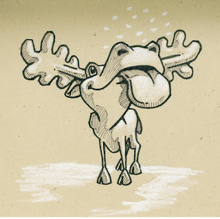
Then I started working on our Holiday card in a blind panic. Couldn't really come up with an idea I was happy with, so started rendering this.
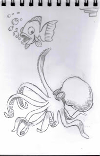
Then, in the middle of it, remembered a sketch I had done at an SCBWI conference a few years ago.
So, I shut down the Chris Moose card until later and banged this one out in a day so I could get them printed in time (thank you, VistaPrint).
You just never know when you'll have a better idea.
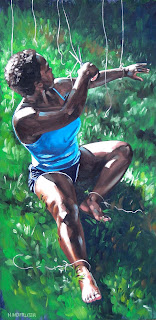
Then, I needed to get a piece of art done for my wife for a Christmas present. She is a HUGE Prince fan, so I did this scratchboard drawing and had it printed on a t-shirt (thanks again, VistaPrint) that she could wear to yoga.
Pretty damn happy with how it turned out and she loved the shirt, so all is good.
Happy New Year to all!
Saturday, December 29, 2018
Labels:
art,
book illustration,
card,
children's illustration,
christmas,
digital illustration,
holiday,
moose,
music,
new year,
Prince,
scratchboard.
Monday, August 20, 2018
Boy, it just seems like icons are dropping like flies. Aretha is my wife's favorite singer, so I had to do a tribute illustration to her. It was done in Photoshop using a fake scratchboard technique I've been playing with.
When I haven't been spending time honoring heroes, I've been busy with more safety posters for Eat N Park restaurants. They wanted a superhero character, so I suggested rendering it like a comic book and my client went for it.
But I'm back to doing the regular style for the rest of the posters.
I've been purchasing traditional art materials, paints, inks, pens, pencils, etc., since last November and have yet to use any of them. Gotta sit down with a sketch pad and some of the new stuff.
Labels:
Aretha Franklin,
comic book,
portraits,
posters,
respect,
safety,
scratch board,
superhero.
Tuesday, July 17, 2018
Work in the studio is picking up, knock on wood. It occurred to me this morning that illustration students are always taught to pick a style and go with it. I've never been able to do that. I find the challenge of trying different styles irresistible. I mean, I wouldn't eat the same thing every day, so why do the same art every day? Anyway, to illustrate that, so to speak, these pieces were all done this week:
Tuesday, July 3, 2018
Turns out, the same collection of artwork is displayed in two different venues and they do a different judging with different judges at each one. Weird, right?
Anyway, I'm very proud of the awards. I guess since I keep winning awards at it I should do more of this painting thing.
What I'm working on now is an experiment. I haven't used gouache paint since art school, where I remember being frustrated by it. So, I'm going to try a gouache painting of this sketch to see if I'm any better at it 45 years later. Also, why is gouache so damned hard to spell?
Keep your fingers crossed. It's too hard for me to paint with mine crossed.
Tuesday, June 26, 2018
Had a blast turning out this new poster for Eat n Park Hospitality Group. I sure wish another client would pick up on this style so I can have even more fun.
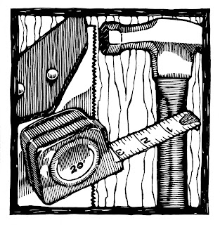
Back in the day, when I was rendering these with fountain pens and ink, I did a ton of this pseudo woodcut look. It was big fun to draw, kind of like solving a puzzle.
This was the first product from Alcoa, an aluminum tea kettle.
And I'm entering this 2'x2' oil on panel painting into a show today. Gonna leave a big empty space on the diningroom wall.
Wednesday, June 6, 2018
Wow, I went from being so slammed with work I couldn't sleep to having so little work I can't sleep. You'd think after 40 years of this I'd be used to the ups and downs, but, sadly, no.
Anyway, I have had some work in the studio to keep me out of mischief.
I got to do another in the series of posters for Eat N Park Hospitality Group. These are in-house safety posters using the department head VPs as the subjects. My client said they're so popular that people are vying to be on the next one each month.
This is a vector logo I drew for my friends' series of how-to classes. They make the best stuff out of what you would think is junk. Very cool stuff.
Capitalizing on the new technique I'm using for the safety posters, I drew (painted?) this sample to send to my publisher, Penguin Random House, to try to get to do the covers for the books I illustrate the interiors of. No dice. I've never seen anything as compartmentalized as the publishing world.
And, lastly, these are some of the finished illustrations for the bio of Nikola Tesla I'm working on. Can you tell I'm having big fun?
Thursday, May 10, 2018
Busy busy busy
Wow, another unintentionally long hiatus from posting. Until recently, it has been chaos in the studio working as fast as I could on all kinds of fun, interesting projects. Now, it's quiet again and I'll have a few days before the panic sets in that I don't have any work. "Gee, that looks like a good dumpster to live out of."
Four months ago I was approached by Eat n Park Hospitality Group to do some safety posters for in-house use. They sent me some samples of the style they were looking for and asked if I could do it. The pieces they sent were all 80s airbrush work and it took me a while to figure out how to pull them off in Photoshop. The fun twist is that they wanted the faces of their various VPs on the posters. It's a fun series to work on and I can't wait to start the next one. They are so popular amongst their people that VPs are vying for their own poster.
Another fun project I'm still working on is another book for Penguin Random House, Who Was Nikola Tesla. Who doesn't love Nikola Tesla?
This comic book project was insanely fun. A lot of it had to be drawn so as to be animated, which made for quite a chore keeping layers labeled. Can't wait to see the animations and printed comic.
This was an oil painting commission for Christmas. The client wanted a portrait of their deceased dog in a copy of Wyeth's Christine's World. Quite a challenge since Christine's World is a very large egg-tempera painting and this is an 11x14" oil on paper. Still, I'm very happy with the finished painting. And so is the client, which is what matters.
I somehow found time to squeeze in this full-page illustration for a gardening magazine. Some stuff is just too fun to pass up.
And, finally, I attended a WPaSCBWI event on picture books and spent the day listening to interesting lectures and doodling. It's what I do.
Subscribe to:
Comments (Atom)


